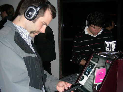
 extrawack! sent lady-about-town and gadget-fiend Priscilla White to a party thrown by Microsoft earlier this week to introduce it's new Zune digital music player to hipsters, tastemakers, and others in search of complimentary hors d'ouvres. Here's her report:
The looks: In these newfangled days of widescreen everything, it's bold to introduce a portrait-style screen a la Zune. But there's no doubt about it: it works. The long screen maximizes space and conforms to the handheld shape so well it makes you wonder why the iPod didn't do it first. After handling the Zune for an hour and being spoiled by the large display, those subway ads for the Nano really lost a lot of their luster. The downside? The casing. I want to love it, but something's off. The whole device is smooth and slim and incredibly light, but something about the seams and chintzy button lend it a Sidekick-style clunkiness. Can't go wrong with the finish though - black, white or coppery-chocolate brown (!!) in understated matte. Que chic!
 What, no touchwheel?!?!: I won't lie, I did feel a little like my mom learning to NOT double-click on hyperlinks. But once you wean your stubborn thumb from its click-wheel impulses, you find that the button (a shallow-push directional pad) is pretty sweet. The songlist scrolls along at a healthy pace, and runs even more quickly when you hold the button longer. Scroll along alphabetically and you'll get a slow-fade heading behind your song titles to let you know what letter you're on. A really slick and unexpected touch, reminding me this is no ordinary beige-box Microsoft device. (Sorry, Bill.)
The interface: Here's where I'm really in love. The menus are simple and well-designed, and the button assignments are intuitive. Your choice of background theme remains displayed behind all the transparent, frameless menus as you tool around, which is cool and gives you more motivation to personalize. It's butter easy to skip around from songs to pictures to movies, and at any time you can adjust your settings and check your memory capacity without danger of interrupting your song. (Have I mentioned my stubborn thumbs already? Yeah, they're also clumsy.) Even the most jam-packed Zunes at the show (filled to about 75% capacity) didn't show the slightest bit of lag when jumping from song to slideshow or beyond.
Beaming: Transferring tunes from one Zune to another takes literally 5 seconds: 3 for one Zune to locate another, an 2 for the song to travel. It's pretty sick. Meek-mannered Zunesters need not worry: when receiving a file, your friend's Zune will simply display a sheer dialog box on top of whatever else it is she's doing, interrupting her only if she chooses to accept the file. And once the transfer is done she can hit "Resume" and keep on truckin. Even I was surprised by how smooth the transition was. Btw, beaming works for photos, slideshows and videos too.
 The catch: Any songs you beam will have limited play on someone else's Zune (3 plays in 3 days). At that point you can re-beam, or you can buy the song for yourself. I only hope Zunepass makes that part just as easy. But you'll never lose track of how much time you've got, since the data display will always show where you got the beamed song from and how many plays you have left.
Stalker bonus? When locating other Zunes you can actually see what those other Zunes are up to! ("Located: Roxy - Currently playing '9-5' by Dolly Parton.") That is, until that Zunester sets their device profile to "basic" instead of "detailed," or shuts you out completely by blocking all beams. Lame!
Battery/earbuds/accessories: Yeah, I can't help you. All the ones I tried were plugged in and came with only schmaltzy noise-cancelling, padded headphones, the likes of which you won't see bundled at Best Buy.
Zune hits stores November 14, $249.99 for the 30-Gb model.

No comments:
Post a Comment